Teaching Color
As early as 1984, when I was at Skidmore, I started teaching color. [Josef] Albers was a huge influence on me when I was young. The whole idea about the Bauhaus as an educational model always intrigued me. Students are really experimenting. They’re not there to make art, they’re there to discover. That can happen in contemporary art education in something like a color class.
I’ve taught the class to graphic designers, painters, illustrators, textile designers. I can teach anybody how to use color consciously and sensibly, but the people who get the most out of my courses are people who already are good colorists. I try to get them to a conceptual matrix, [which] empowers them to make their color choices more sophisticated. And more varied; they become less repetitive because they’re able to think about it at some little distance. That’s really the key. [For other students, it’s like] music lessons: You can’t turn someone who has no inherent musicality into a real musician, but you can teach them to play the notes, feel a sense of accomplishment, and enhance their appreciation. In that sense, it’s a very valuable thing.
Simple Images/Complex Idiom
I like things to be as spare and simple and direct as they can be, if they can still yield meaning. It’s almost like the writing of Raymond Carver. There’s something very declarative. He just lets the words construct the reality; he doesn’t milk it.
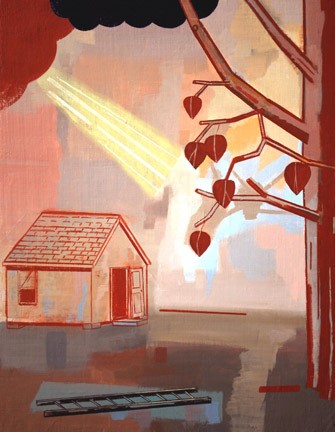
[My iconography] tends to be rural in nature rather than urban. It tends to be prototypical objects, [such as] rude buildings and tools. I like dividers, like fences and walls, because they’re really useful in painting, to push the space together and direct the eye. The iconography ensures a wealth of shape vocabulary.
This particular show of my work was preceded by six months, at least, of pure failure. It took me a long time to find the right kind of attitude pictorially. I’m almost there, [in deciphering] what are the variables I can work with, what is my language?
Graphic Influences
The visual language comes from Chinese woodcuts, comic books, primitive or self-taught painting, graphic design. I’m interested in combining tonal and graphic to a degree, but the work is essentially graphic, it’s flat. [I’m a fan of] Ernest Bushmiller’s [comic strip] Nancy; I love the way he stylizes. Also Mogul miniatures: the color is such an important issue, and the space is very conceptualized and stagelike. There’s a convention, but the [forms are] also powerful abstract shapes. There’s a natural reference and also an abstract relationship. That’s exactly what I want to do.
Musical Parallel
Some artists work with language as a model. They’re interested in delivering information. [But] I think painting is a very poor informational delivery system. I see the painting as more akin to music than to language. The only form of language it relates to at all is poetry. Painting has a subverbal form of reasoning—it has cohesion and intelligence, demands and rigors, but at the same time it has a very direct conduit to the emotional life and psychological life of the viewer. My reason for making this is very akin to a sax player working out what phrase to play next and how to phrase it.
Missionary Work on the Island
I love my job [at Adelphi University]. I’ve been able to hire who I’ve wanted to work with, and we’ve built a really good BFA program in visual art. We’re working mostly with kids with backgrounds not steeped in fine art. Most of them have never been to a museum, even though they come to us as art majors. It’s typical of contemporary American life. Visual art is a very marginal activity and so we have the opportunity to do really good missionary work, and make a difference in the lives of these young people.
Make a Move
A good painting is like a good chess move. The game of chess is so ingenuously devised that if you make a move, unless you’re a chess master, you understand only a few ramifications of the move. Then the combination of moves becomes geometrically amplified. Painting’s like that. If you’ve created a good sense of variables that are lively, and work with good shapes, and work consciously and diligently, it’s like chess: You make a move and it will have felicitous ramifications that go beyond your intent. And that’s good painting, really—where things start happening that are bigger than you are.