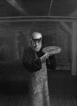
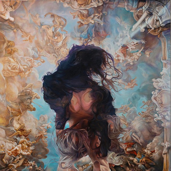
One day in the 1980s, painter Stephen Hannock took a power sander to a canvas he was struggling with and ground away at the pigment. He was only trying to strip away unwanted paint, but when he was finished, Hannock had created a surface that captured light with subtle and luminous beauty. The technique established the artist as an heir to the 19th-century landscape paintings of Thomas Cole and the other artists of the Hudson River School. But sanding was only the first of the happy accidents to shape Hannock’s emerging aesthetic. Some time later, he was using an old envelope to soak up excess oil on a painting so it would be ready to sand more quickly. The scrap, smudged with paint, dark with type and translucent with oil, had a magical surface. “What I saw on that envelope,” recalls Hannock, “was considerably better than the painting I was working on. It touched off a whole appreciation of the concept of palimpsests, different layers of stuff on top and beneath the surface.”
Before long, Hannock was writing on his paintings, and embedding photographic images into his sweeping, panoramic views. At a distance, his paintings look like traditional scenes of rivers, mountains, or city skylines. As you approach them, though, they envelop the eye in layers of visual and textual interplay. “A canvas is just as close to dead space as you’re going to find,” the artist says. “These layers of meaning have added to the adventure of painting.” Born in Albany, New York, and educated at both Bowdoin College and Smith College (as part of an inter-college exchange program), Hannock’s work has joined the likes of Thomas Cole and J.M.W. Turner in New York’s Metropolitan Museum of Art and other major institutions. His exhibit, “Luminosity: Paintings by Stephen Hannock,” is on view at the Albany Institute of History & Art now through September 2. A sampling of Hannock’s preliminary paintings (some of which employ digital photography) are at the Berkshire Museum in Pittsfield, Massachusetts, through September 3.
STEPHEN HANNOCK ON HIS WORK
Thomas Cole’s influence
Cole is a reference point for me. I lived in Northampton [Massachusetts] when I first started painting, in the ‘70s and ‘80s, and his painting The Oxbow, of the Connecticut River, has a huge presence in that area. Over time, I noticed that he’s got a self-portrait in the picture, waving back to the fans. I wanted to answer that vista, to paint that place. I went up to an area that was the launch for hang gliders, and just imagined myself being 400 yards off the cliff. That’s where the original drawing was done from. Characteristic of all my compositions is that I don’t have any foreground. So here I have this oxbow [The Oxbow, after Church, after Cole, Flooded, 1979-1994], but I’m not having any hillside where Cole is waving to the fans. At the same time, the concept of the palimpsest had become really evident to me. I was trying to figure out how to claim this land, and I just started writing on the painting, right through the cornfields: “Gordo the wacko almost blew Jimmy’s head off with an M-80 right here on the riverbank.” This real-life activity. It became very clear that the people I had known, family who came to mind while thinking of this area, were so much more important to me than the topography. The topography was the excuse to hang the light. The people were the amazing thing. The canvas became a kind of diary, all these stories of people as they affected me. So the paintings are, in that sense, self-portraits.
The act of painting happens quite spontaneously. It’s a combination of your original idea, and then responding to the accidents that happen as you’re approaching that idea, which is a little vague. You’re much more confident of what you don’t want to do than of what you do want to do. After an under-painting is completed and you are involved with the composition you’re working on, these stories start coming to life. You grab them as they come and put them down the way you would draw. They go down right on the canvas, as spontaneously as a drawing gesture would. They actually follow lines where a drawing would go. You reinforce the armature of the composition with the text.
Hanging the light
The kinship I feel in regard to American painters is with guys like Sanford Gifford and George Innes—the moodier artists they call Tonalists, an even more sophisticated sect than the Luminists. Innes got into using washcloths the way I use power tools, constantly working the surface, going for the mystery. Turner and Whistler are the painters who really take me where I want to go. Turner, in particular, is always a presence in my work. I particularly respond to his lack of necessity for overdoing paintings. That’s the problem I have with traditional landscape painting, the Hudson River guys. It’s too fussy. Going for the surface that allows you to see that mood—that can’t be achieved when there’s all the glare off the varnish. I rip into my paintings with power tools and eliminate any gloss that would reflect light and interfere with the perception of the mood. That will obliterate even the fussiest painting surface. That’s how Turner always painted. Always the light.
Origins
I really thought I was going to be a pro hockey player. I played goalie while I was at the Albany Academy, and took a post-graduate year at Deerfield Academy, a really tough boarding school in western Massachusetts, to play hockey. There, I took this art class just to chill out, and the teacher kicked me out and said, “You can draw, just go draw.” It was the first time I ever paid any attention to it. Nineteen years old. I came right from the hockey rink to [studying one-on-one with artist] Leonard Baskin at Smith College. That was the best art school in the world. Baskin was figurative, completely at the opposite end of the abstract work of the time, but his surfaces were flat—that modernist flatness—and I rebelled against that. I was really trying to get a depth I wasn’t seeing in Baskin’s work. The thing I took from the Expressionists wasn’t the flatness, it was the fluidity with which the paint was applied. Particularly the early [work of] Pollock and Franz Kline, the calligraphic gestures. Those are magnificent.